Maria Killam | Classic and Timeless Colour |
| What Colours Are Trending on Commercial Exteriors? Posted: 31 May 2021 12:05 PM PDT
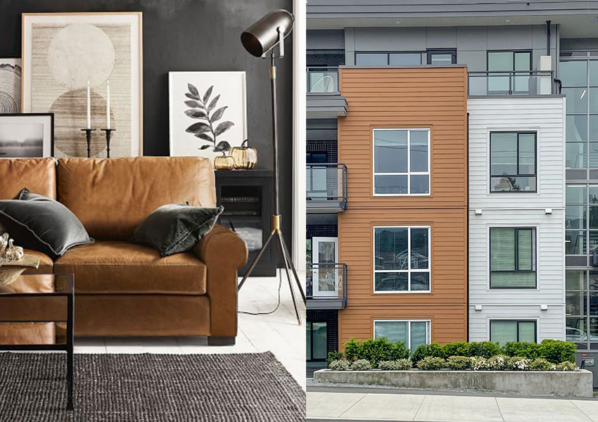
The view from our getaway this past weekend The black and white trend is quickly taking over commercial exteriors to the point where they all pretty much look the same; black + white + grey or wood (below right). And it duplicates the trendy interiors we’re seeing as well (below left).
Black, White & Cognac Pottery Barn I have been in the business of colour for more than 20 years, which means I have specified colour through two decades of colour trends. Brown in the 2000s and grey in 2010s. Throughout these decades, we specified a range of trendy colours. Which means we didn’t give everyone the same brown/pink beige/taupe colour or greige/colour/medium grey/charcoal shade, there was range. Even though the range was still in the realm of trendy. All that being said, I can count on one hand how many times I have specified charcoal for an exterior. It has a place. It simply WAS NOT the answer for every single exterior during the time when everyone was in love with grey. Anyway, now that the black and white trend is in full swing in the 2020s, the colour scheme is almost identical everywhere. Either a stark white or basically black or close to black exterior. ALWAYS with black windows, of course. In my Masterclass for Exterior Colour Selection, I talk about a white exterior being timeless. But a white farmhouse with black windows? Looking the same as every other house on the street? Definitely TRENDY. In case you’re wondering. Now, is that trendy black and white exterior BETTER and much prettier to look at then the ALL bleak charcoal exteriors from the grey trend or the mish mash of undertones that everyone ended up with in the brown trend? It absolutely is. UNLESS you decided your white house had to look different from your neighbour and added some unnecessary black or charcoal stone somewhere. I talk about that in the Masterclass as well. In my eDesign department, the theme is ‘How white can we go?’ since we get a lot of clients who have existing earthy stone that must be considered. Earthy stone immediately eliminates stark white as a possible option. Adding a warm greige or complex cream to an earthy exterior, or painting bad stone or brick is a wonderful way to make it feel fresh and current. Okay back to my trends review, when I was growing up, white was the ‘builders beige’ that everyone got when they moved into a new apartment. Then, in the 80s, everyone started experimenting with colour on their walls. Accent walls were big (they just weren’t black). In the 90s and 00s, no one moved in without painting their entire house varying colours, or calling the colour consultant to come over and help choose colours. Back then, the only place you could find a colour consultant was at a paint store. Designers, seeing the opportunity to add this valuable service to their list started getting trained to overcome their fear of colour. Then colour became mainstream along with open concept floor plans. Clear transitions from room to room disappeared and it became difficult to specify a different colour for every room. The concept of the ‘main neutral’ was born. Rooms with colour are now mostly relegated to the dining room, powder room and bedrooms. Therefore, after that brief colour history moment, you can see it’s been a long time since WHITE WALLS were actually a thing. I get the obsession. It feels fresher than anything else. White makes you feel like you can exhale. It’s a blank slate, like anything is possible. White walls reflect energy, black walls absorb it. But white all alone, seems boring. Enter black accent walls (nooooooo) and black windows (not for e-v-e-r-y house) and cognac leather (thankfully this is timeless). However, I find it fascinating that basically the colour of cognac leather (orange) is being added to commercial exteriors in the form of orange stained wood, to add warmth to the now standard black and white scheme as well (below).
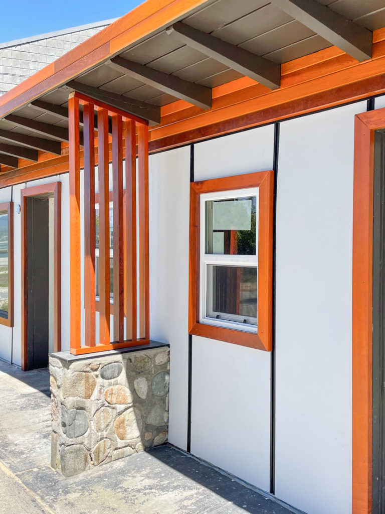
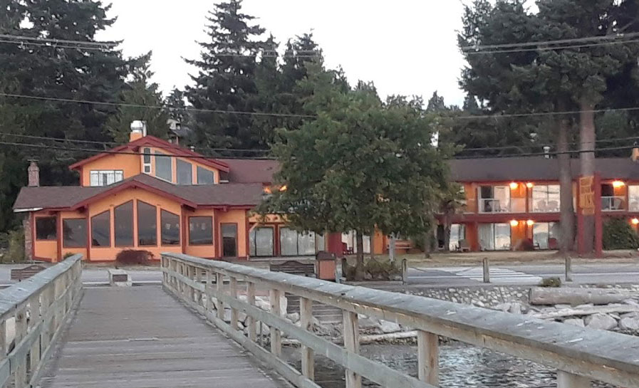
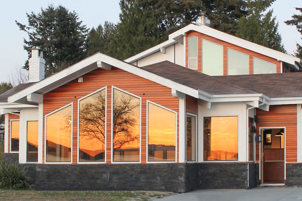
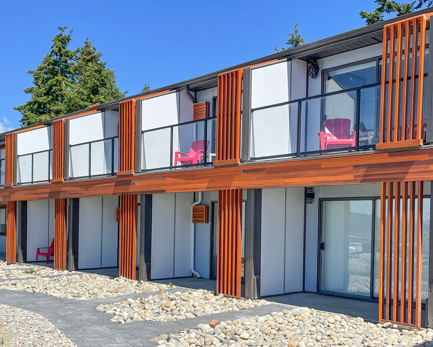
And it’s a good thing because in this case, it actually works, by default. In the grey trend, we didn’t have a warm, trending COLOUR that balanced all that grey, therefore many homes inside and out, looked simply debilitatingly drab. Which is how grey can feel when it’s overdone. Therefore, the current, trending colours are actually way better than the brown on brown exteriors of the brown trend, and the all grey on charcoal exteriors of the grey trend. However, where you shouldn’t add orange stained wood is to an all black exterior WITHOUT any white. That gives you a look that reminds us of Halloween. Just like yellow and black without any white ends up looking like a bumblebee. When we drove through Davis Bay (Sunshine Coast) this weekend, on our way to where we were staying, I noticed this hotel had had a big exterior renovation. This is what it used to look like:
This is what it looks like now:
Here’s the rest of the motel. The red Adirondack chairs do hurt my eyes, this is when black would have been the right choice (below).
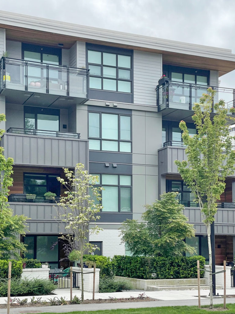
There’s a street in North Vancouver where they are tearing down homes and building condos and townhouses. This is how it starts. I’m guessing this one was built first (below). The orange wood stain was installed INSIDE the balcony of the first two floors and then what happened? Did they run out of cash? Or decide it wasn’t doing enough to warm up the building (newsflash it wasn’t).
Then this is next:
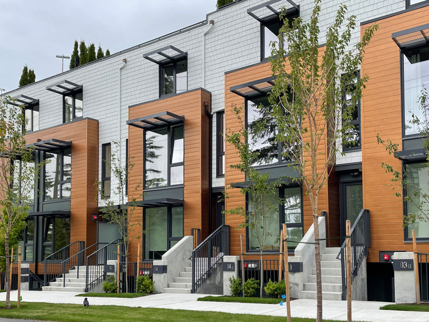
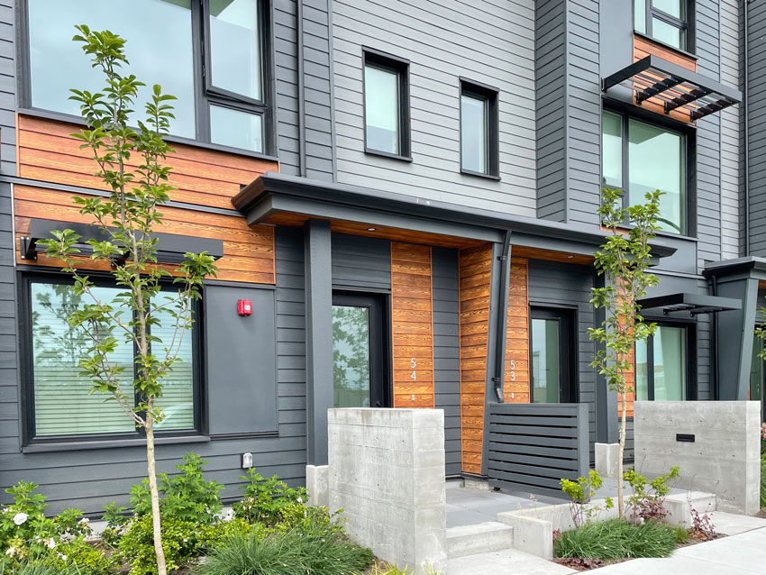
Better. We have contrast, a balance of warm and cool. It’s sophisticated and clean. Thank goodness for COLOUR. I’ll take orange if nothing else.
Another version, a lighter, more gold beige wood stain.
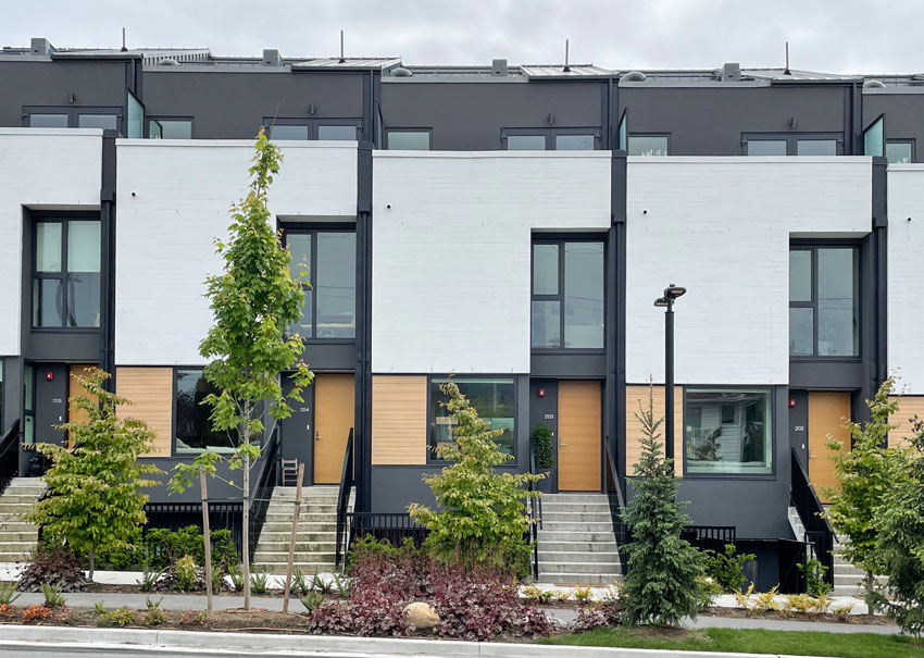
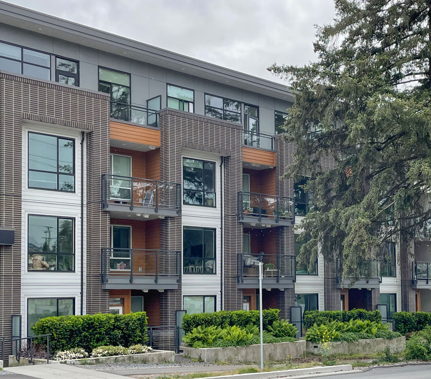
Here, they’ve added liner stacked brick with more stained wood inside the balconies. This one (below) needed lighter tones or white added. It’s heavy in mostly charcoal with orange stained wood. Which you can see is already looking like it needs to be re-stained. That’s the piece most people don’t realize. White is needed for balance and freshness along with the warmth of orange. I’m assuming stained wood accents like this last longer in dryer climates but here in the Pacific NorthWest, this kind of stained wood is high maintenance. Every two years it needs to be re-stained.
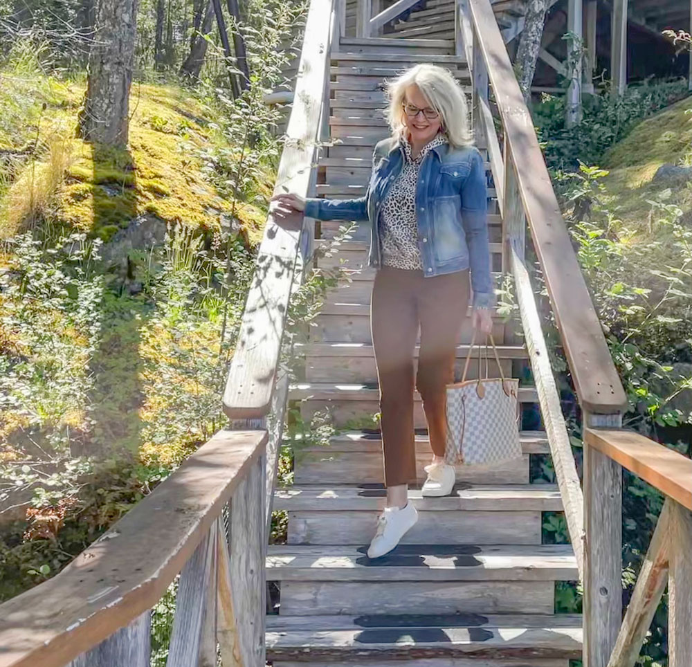
Here’s my black, white and cognac look from the weekend Read more: The Perils of Decorating with (Too Much) Black
Over to you my lovelies! Have you noticed this trend in your area as well? If you’d like to learn how to choose timeless exterior colour, buy my Masterclass for Exterior Colour Selection here. You can watch it at your own pace and you’ll have lifetime access. I just received a new testimonial this morning and this is what it said:
Related posts: The 3 Fundamental Guidelines for Choosing the Best Neutrals The Best Colour Advice for Painting Your Exterior Trend Alert: All White + All Black Exteriors The post What Colours Are Trending on Commercial Exteriors? appeared first on Maria Killam | Classic and Timeless Colour. |
| You are subscribed to email updates from Maria Killam | Classic and Timeless Colour. To stop receiving these emails, you may unsubscribe now. | Email delivery powered by Google |
| Google, 1600 Amphitheatre Parkway, Mountain View, CA 94043, United States | |

 Notice a little black is often enough.
No comments:
Post a Comment