Maria Killam | Classic and Timeless Colour |
| Ask Maria: Help Me Ditch My Farmhouse Style for Something Moodier Posted: 04 Nov 2021 07:25 PM PDT Ready to change your farmhouse look into something fresher? This reader wants help creating a moody living room with more colour. Here are my best decorating tips to help her transition from a bland farmhouse look into something more layered and chic.
Help Me Change My Farmhouse Style Living RoomMy dear reader, here’s my decorating advice to help you create a moodier and more colourful living room that fills you with joy.
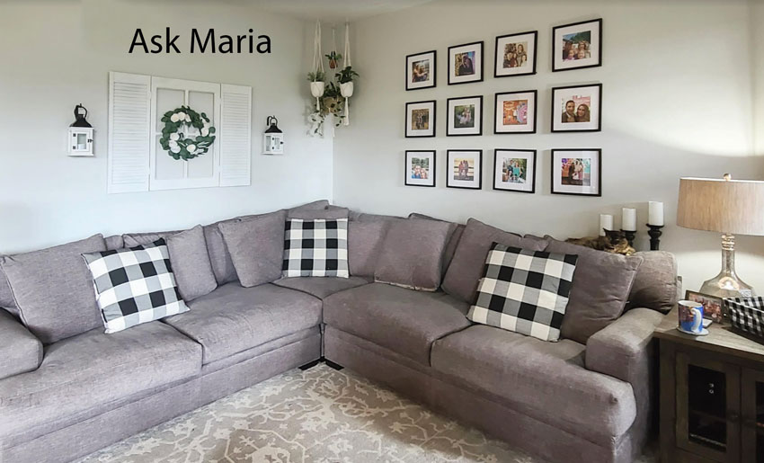
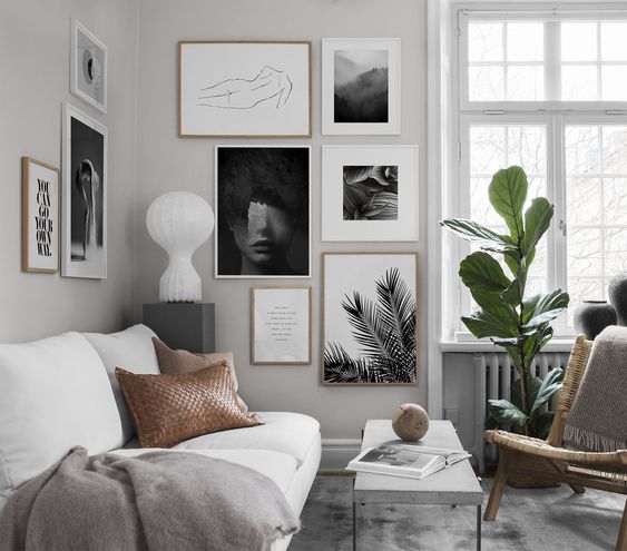
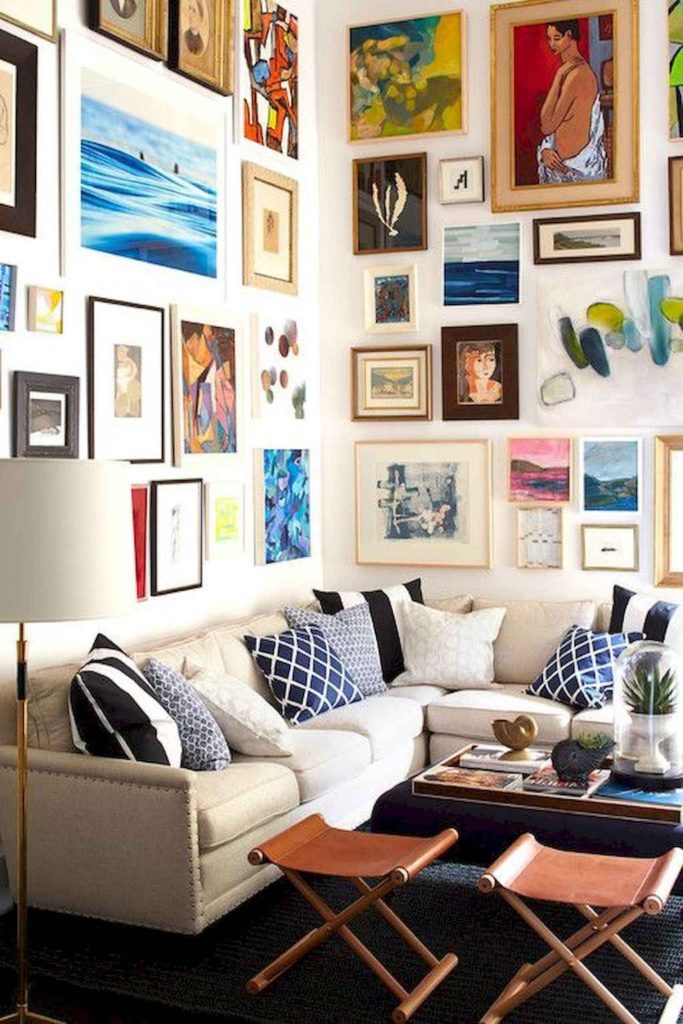
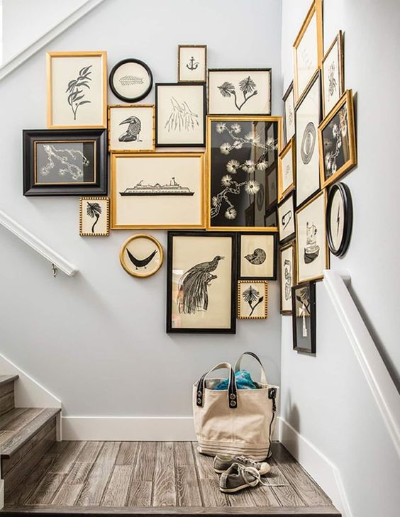
First, let’s talk about your walls. When you have two walls in a corner that looks like this, both walls visually read as one wall. Therefore, whatever you hang needs to read as one curated space. Here’s what I mean. In the photo below, the gorgeously rich and varied gallery wall wraps the corner seamlessly and totally makes this room.
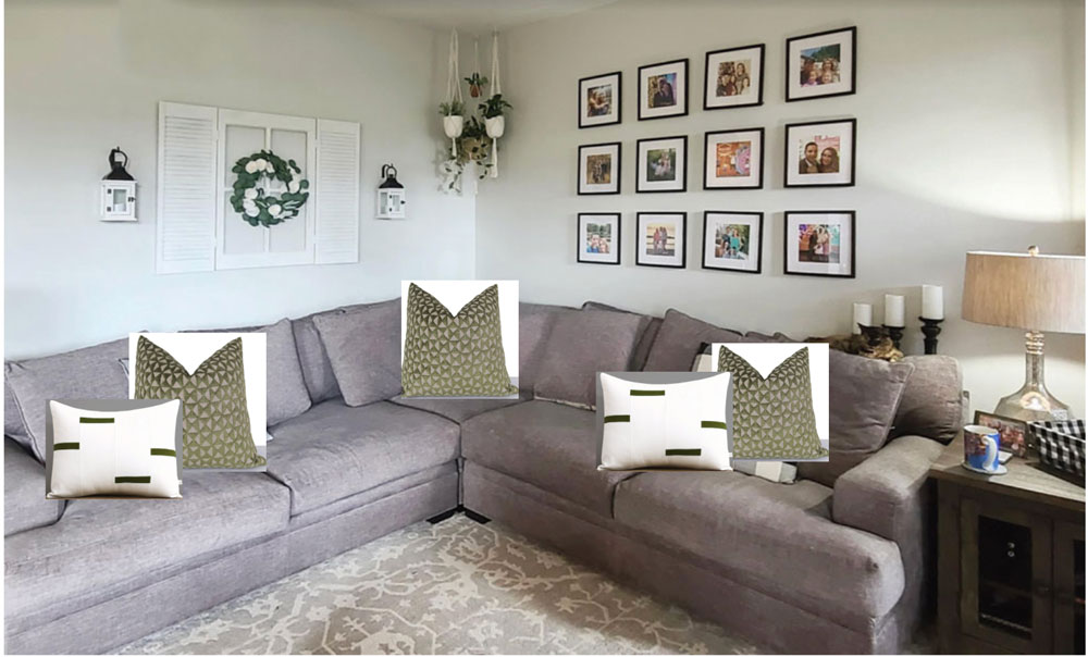
Create a more interesting gallery wall of colourThis kind of look takes some collecting, sure. Don’t be afraid to start at flea markets or art print sites like Society6. Or even try framing images torn from old art books. The basic idea is to fill your gallery wall with colour. Notice too, the softer, warm-toned frames in varied shapes. This creates interest so that you’re not looking at a black grid, which is not very visually dynamic. A well-curated gallery wall is a great solution for more depth if you’re keeping pale, almost white walls. When I look at your room, I don’t see any black. (the picture frames don’t count). This is likely why the black and white buffalo check pillows are not working. And again, the sofa needs MORE – more layering, more interest and more texture. Read more: A Shocking Way to Get the Art that You Want Be prepared to let goBut the main thing holding you hostage here is that your sofa is violet grey and the carpet has a green undertone. Unfortunately, once you’ve chosen two unrelated neutrals, there’s often no way to bring them both together in a way that will look amazing. Below I’ve quickly added some olive pillows to pull in the area rug. It’s not fabulous yet, is it?
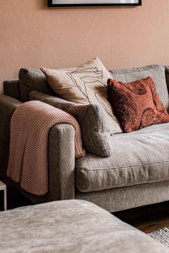
BUT – there’s a lesson here we don’t want to miss. The reason you can SEE that the green pillows work better on this sofa than the black and white ones is because we added them to our ‘mood board’ by literally placing them on top of our sofa in this photo. Using mood boards helps you identify the right colour palette and also make sure that what you order online will end up arriving the colour you are looking for. Learn how to create mood boards and make sure all the colours come together in my shop online course here. So, when I say the conflicting undertones are holding you hostage, I really mean it. It looks like a pretty rug, and probably you’re attached to it. And it sounds like you’re not replacing the sofa anytime soon. But one of these things has to go. You’ve stared at this living room and it isn’t making you happy. And it can be hard to put your finger on what is wrong. Do you know the saying where you can’t see the forest for the trees? But, once you recognize that these two neutrals don’t relate and that the look you are trying to achieve simply won’t work, it can be very liberating to decide to let something go. Find colour inspirationLet’s say that the area rug can be shifted into the bedroom or family room. This allows you to begin your redesign with a bigger element to play with. It also eliminates the conflicting neutrals in the base of your room design. Then, let’s gather some inspiration. Violet greys look lovely with warm on-trend peachy pinks, terracotta, or rust as in this vignette below.
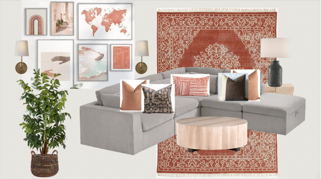
Based on this colour inspiration, we could start with a burnt orange area rug and some matching pillows. And choose some pieces for the gallery wall that also pick up the colour palette, like this below.
Area Rug | Blush Pillow | Bird Pillow | Lumbar Pillow Add more lightingYou probably already know I’m going to mention some lamps. I love incorporating sconces into gallery walls, especially behind sectionals like this where there’s no other way to install a lamp. They don’t have to be wired in. Plug-in sconces with cord covers work beautifully as well. And don’t forget lamps. Lamps add more atmosphere, which creates MOOD. Now for that moody look you are wanting… With very light walls, it might be harder to achieve “moody” but you can certainly get a much warmer and layered look. If you have a room stuck in the farmhouse trend or a bland grey, black or white room, bring your room to life by adding rust, gold, peach, cognac or muted plum. When you’re done, see if you can add MORE LAYERS and interest by repeating the warm tones in your new colour palette. Then repeat the new palette in the adjoining rooms to help create flow. Is your home decorated in grey, black and white – a la modern farmhouse – and are you looking for ways to shift into the new warmer trend? I’d love to hear your thoughts! We will be announcing new Spring virtual Specify Colour with Confidence dates soon, sign up here to be notified! Related posts: My Best Decorating Advice for Your Living Room Inside my Nephews Bachelor Pad Makeover; Before & After Ask Maria; Help me Decorate my Home Office The post Ask Maria: Help Me Ditch My Farmhouse Style for Something Moodier appeared first on Maria Killam | Classic and Timeless Colour.  |


| You are subscribed to email updates from Maria Killam | Classic and Timeless Colour. To stop receiving these emails, you may unsubscribe now. | Email delivery powered by Google |
| Google, 1600 Amphitheatre Parkway, Mountain View, CA 94043, United States | |


No comments:
Post a Comment