Maria Killam | Classic and Timeless Colour |
| Help! My Paint Colour Looks Different on the Wall than on the Door Posted: 24 Feb 2022 07:33 PM PST I am heartbroken by what’s happening to the people of Ukraine. I asked my followers on my stories today where was a reputable place to donate and this charity and this one was mentioned over and over again. I just sent $2000 to each one!
The fundamental insight of my entire colour system is that you can’t see the nuances of colour without direct comparison. This means that proper testing, which is essentially comparing effectively, is the piece that makes it all work. However, there are endless ways that colour testing can go wrong when it’s not done right. Here is a real life situation I want to share with you because it perfectly illustrates why improper colour testing is a BIG misleading problem. My lovely reader sent me the following exasperated email:
Why you shouldn’t test your paint on the wallBelow is the image she sent in that I really want you to see. No one can blame her for testing her colour this way, if Google has anything to say about it, this is just how it is done. (NOT TRUE!) I want to show you once and for all, that a colour swatch floating on a wall randomly tells us nothing about how the colour will relate to the finishes, decor and furnishings. Ultimately we can’t see if it is the right colour to pull the room together at all when testing this way. 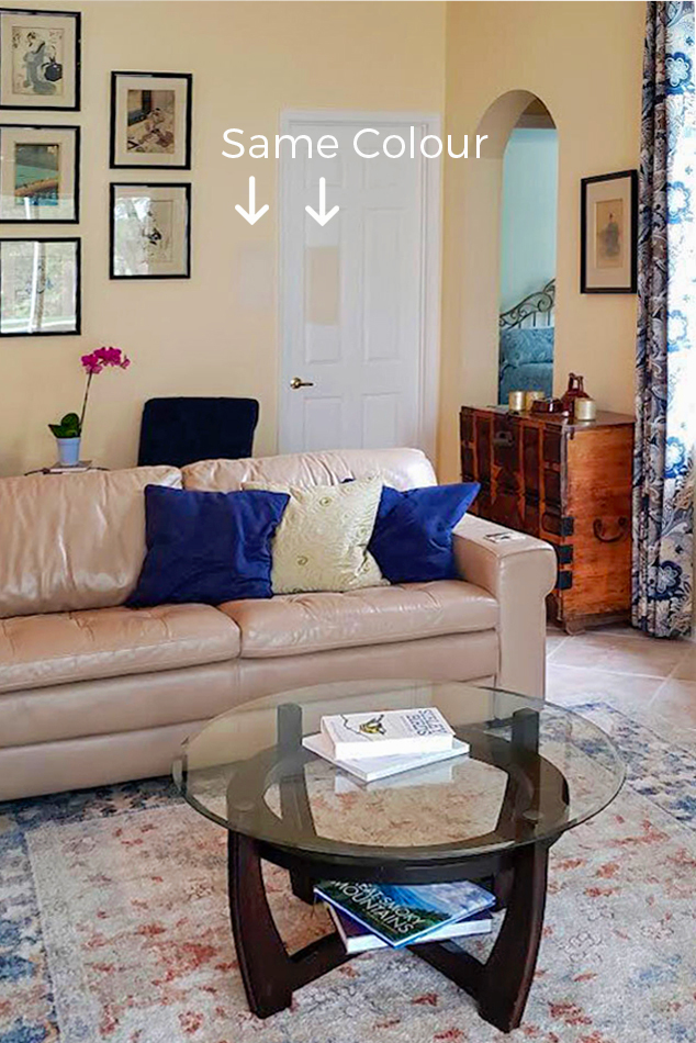 She’s right, it’s not about the lightLet’s take a closer look. 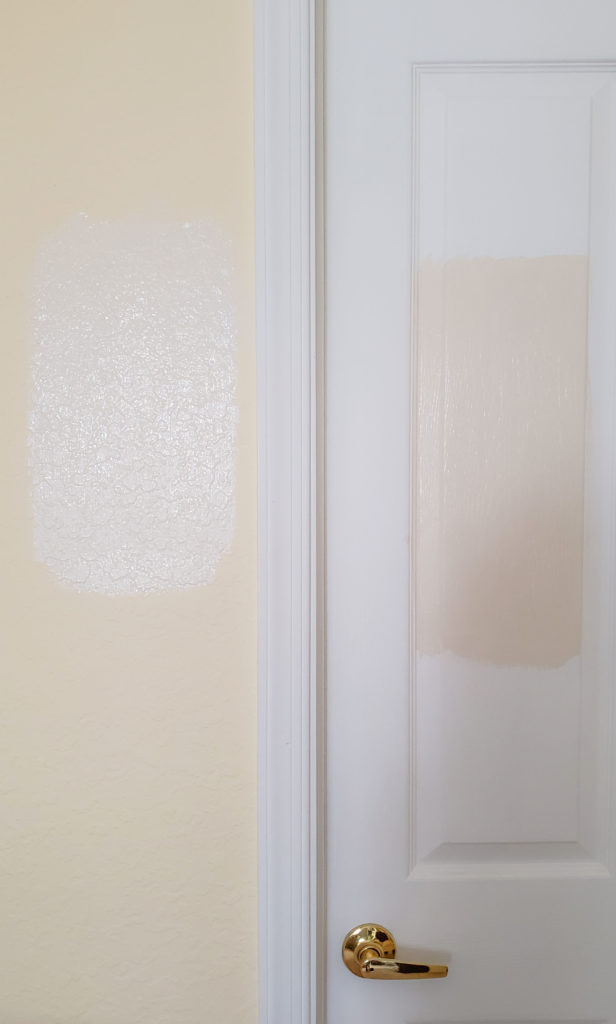 Same colour swatched on yellow wall and white door – NOT THE WAY TO TEST It’s not about surface texture either. While the same colour can look slightly different on a smooth (door) versus textured (wall) surface, that’s not it in this case. So what’s really happening here? Colour always exists in relationships, it’s relativeWhat we’re really looking at is a perfect example of how colour interacts in a relative way. That means that any given colour looks completely different surrounded by different colours. Take a look at this example below. Swatch an orange-red brown onto onto a warm (much cleaner) orange-red wall, it will look brown. Swatch the same colour on a brown wall, it will look red-orange. 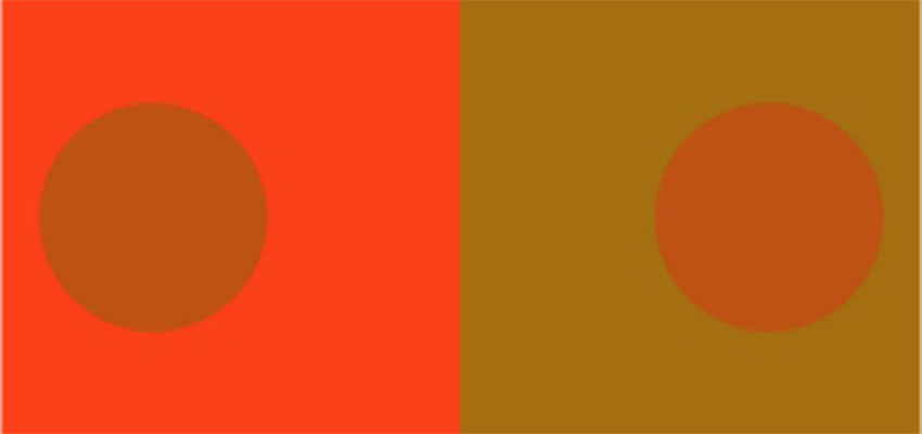 The dot on both sides is the same colour being influenced by the colour surrounding it this is known as simultaneous contrast. See? Colour is influenced by the colours surrounding it. And not because they reflect on each other, but because their relative hue qualities are either emphasized or diminished by how they stack up to the colours directly beside them. This can be a rather technical nugget to wrap your head around for sure. But you can see in my reader’s example above how the existing warm saturated yellow wall colour is making her creamy sample look greyed and sapped of warmth. That’s because the yellow is so much warmer and more intense. On the white door, the colour looks “true” a warm orange beige complex cream. The right way to test colourThe other issue as I mentioned is that it’s important to compare any colour you’re testing DIRECTLY TO THE ELEMENTS IN THE ROOM IT NEEDS TO RELATE TO. In this case, if she’s going for a pale neutral, that’s the sofa and the floor. The only way to properly test the colour to see if it relates to her leather sofa is to paint it up a large test board and prop it vertically on or behind the sofa. WITH WHITE BOARD BEHIND IT, because otherwise you will have interference from the existing wall colour, and you won’t be able to see the colour accurately. 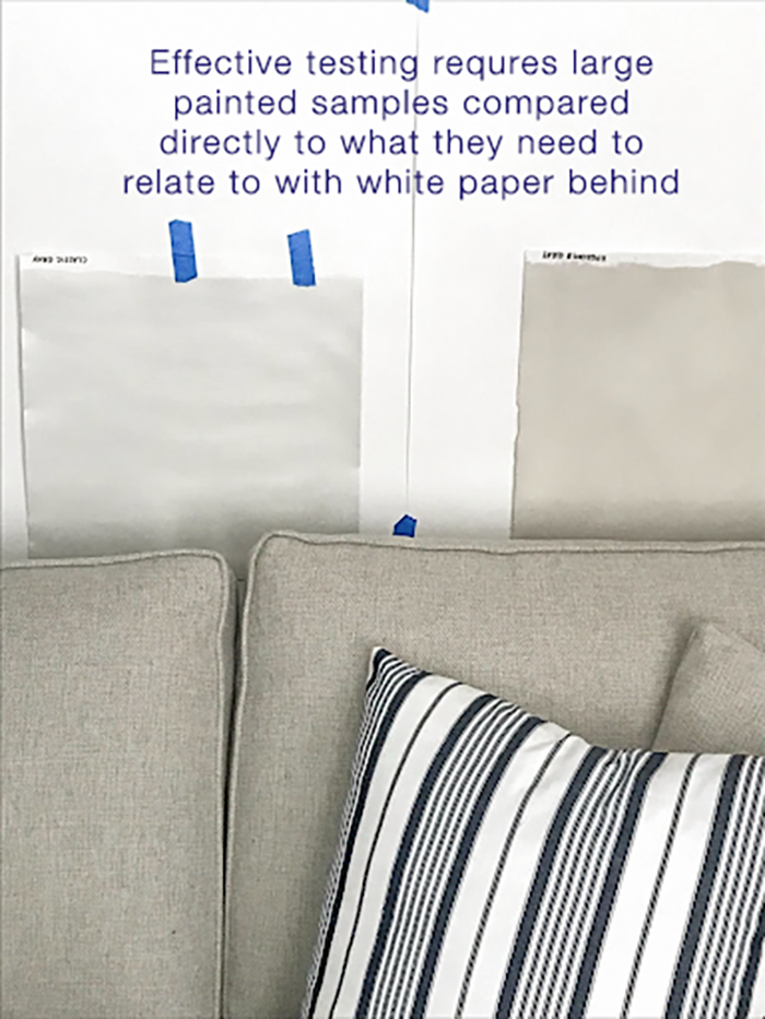 You can see in this image above that the green grey greige (above sample on the left) and green grey (above right) samples being tested do relate to the sofa. If the wall behind was beige or blue or yellow, it would skew the look of these green grey samples. This is why I can’t stress enough why isolating the colour you are testing with white paper is essential. To my eye, my reader’s sofa looks too pink to work with an orange beige complex cream. Here’s what an orange beige complex cream, very similar to the colour she’s testing looks like. It’s the wall colour in my newly decorated living room to work with the orange undertone of my sunflower yellow sofa, leopard prints and natural fibre area rug. 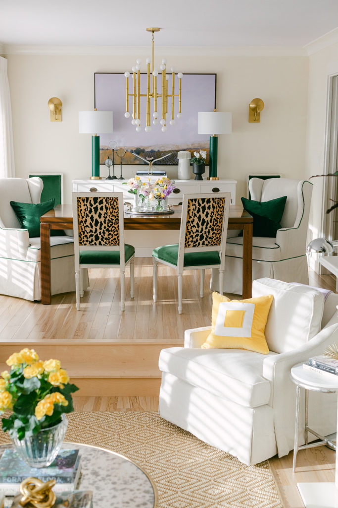 The best way to choose the colours you want to testTo get off the crazy train of testing reams of random neutral colours for your room, and STILL not getting the perfect colour. You can use my new, true to colour, painted neutral colour wheel to dramatically narrow down the undertones you need to consider. If you have a copy of the wheel you can place it directly on the sofa and floor tile to compare and see which undertones look closest. Then, reference the categorized by undertone curated neutrals in my system, listed in my ebooks, to find the right colours to test. 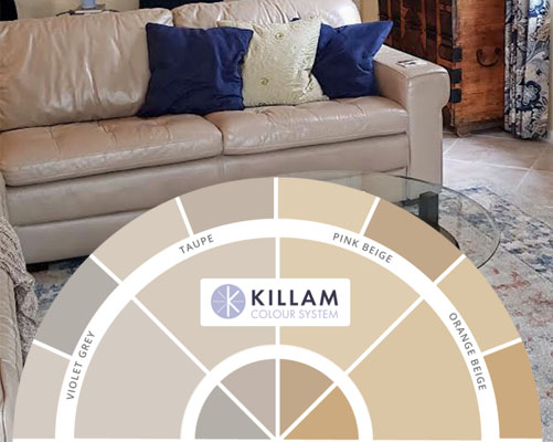 Even with the digital colour wheel pasted onto her image, you can see that the world of orange beige, where the colour she’s testing belongs, is much too warm and yellow for her sofa and floor. 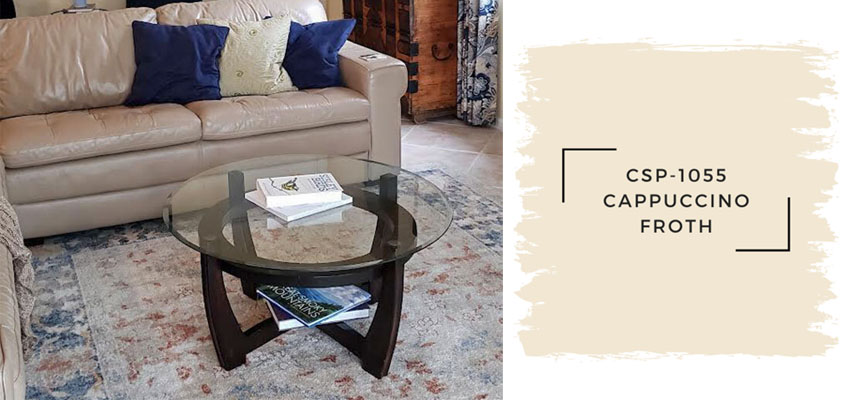 It looks like she needs to shift two undertones over on my colour wheel into a fairly pink taupe greige (a bit pinker than Pale Oak, the taupe greige she mentioned she’s considering, though it’s worth testing too). 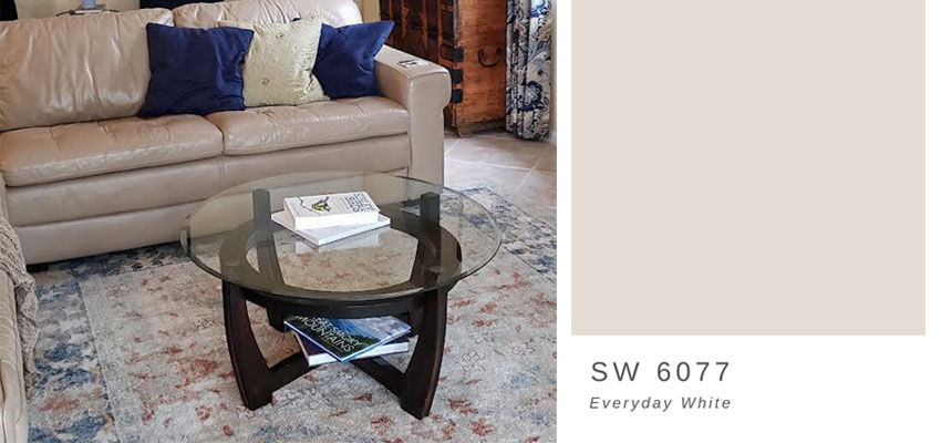 Can you see how this pink taupe greige digital swatch looks closer to the sofa and the floor tile than the more yellow, orange beige complex cream? How cool is that?Remember though, whether you are using digital images, or using your very own copy of my colour wheel compare and narrow down your options, you must ALWAYS ALWAYS follow up with a real life test with a large painted sample. Compare it directly to the sofa and the floor tile, in this case, with white paper behind. Stopping short of this, you’re only guessing. And testing incorrectly is a mistake that is likely to cost you a repaint. It’s important to make sure that you are comparing the colour directly to what’s staying in the room, and NOT the colour you will be painting out. Learn more about my neutral colour wheel here. Get your very own curated by undertone collection of large painted colour boards here so you never have to guess again! PS. My first Virtual Specify Colour with Confidence event happened last Thursday and Friday! April 23 & 24, 2022 (Weekend dates) May 19 & 20, 2022 June 9 & 10, 2022 Related posts: The post Help! My Paint Colour Looks Different on the Wall than on the Door appeared first on Maria Killam | Timeless Colour. |

| You are subscribed to email updates from Maria Killam | Timeless Colour. To stop receiving these emails, you may unsubscribe now. | Email delivery powered by Google |
| Google, 1600 Amphitheatre Parkway, Mountain View, CA 94043, United States | |


No comments:
Post a Comment