The Interiors Addict |
| The 2021 colour trends to shape our interiors revealed by Haymes Posted: 30 Aug 2021 06:00 PM PDT Haymes Paint has launched its latest colour library, Awakening, offering a first glance at the vibrant new shades that will define the year's interior trends.  As the world adjusts to the new normal, Haymes Paint hope to inspire people to embrace change. We are grounded, reinvigorated, and ready to break free (literally!). A set of three unique colour palettes: Game Changer, In the Moment and Clearview, dares customers to break the status quo while maintaining a sense of calm and wellbeing throughout their spaces. The range features hues that combine the concepts of strength and change. These concepts evoke passion and a sense of drive to embrace new opportunities as we emerge to new experiences and realise the true essence of what it means to be alive. Haymes Paint colour and concept manager, Wendy Rennie, says: "Our new colour library is influenced by Australia's slow rekindling after what has been an unimaginable time. We wanted to use colours to inspire our customers to create a space that is uniquely theirs and embrace the new way we live and grow in our homes." Game changer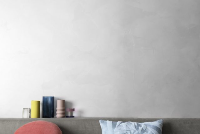 The Game Changer palette encapsulates newfound freedom to be yourself and challenge everything with a playful vibrancy and fresh optimism. Powdered blue, shades of sunset pinks, aqua greens, and mustard yellows will bring a sense of fun and lively energy into our homes. Game Changer encourages us to break free from the limitations that have constricted our creativity and find the courage and drive to be truly free and original. 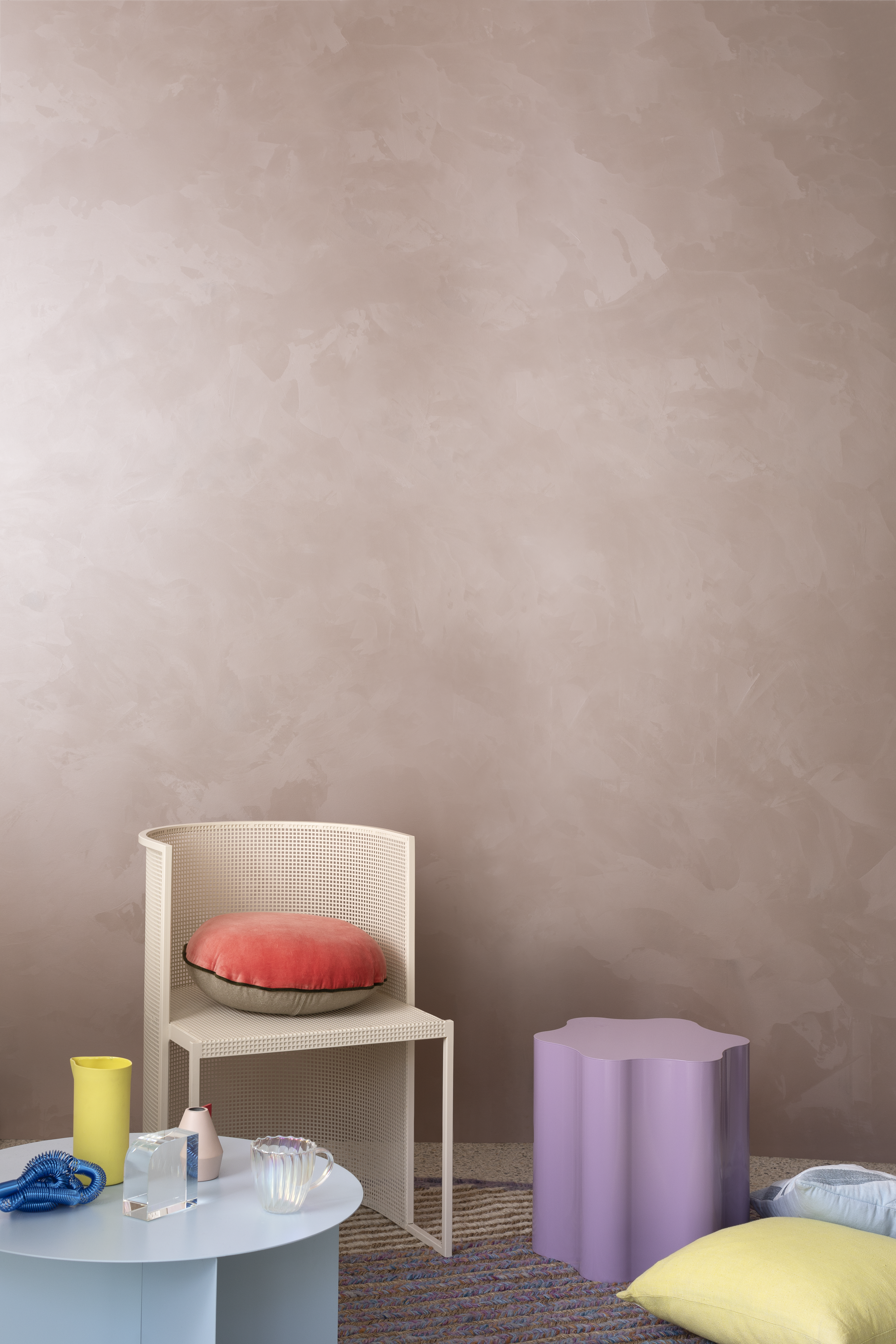 In the Moment A fresh take on the Australian landscape, the In the Moment palette features an array of varying shades of rust, earthy browns, burnt oranges, and organic neutrals to promote a sense of groundedness. The array of tones reminds us to find value in what we have around us. Using layers and tactility, we can create spaces within our homes that reinforce a sense of security. Our surroundings are truly linked to our wellbeing and it's the details of the things we love that provide us with the strength to face the new normal, by creating a home that is connected to the essence of the Australian landscape with a robust aesthetic. Clearview Clearview represents the idealised tree change, sea change, and everything in between. Whether it's an aesthetic we can now adapt to the style and feel, or a true location change, this palette brings these ideals to life. Its colours range from deep tones of ink blues and dark forest greens to light greys and powder blues. The new normal is to look for ways to promote idealism and to live in a way that is reflected in our day-to-day lifestyle, the core of what makes us feel the most fulfilled. Clearview enables us to create an everyday feeling of harmony, as we live more aware and in sync with what it is that truly aligns with our core values. –Haymes Paint is the largest Australian made and owned paint manufacturer. It has maintained its head office and manufacturing in the same town where it all began, a decision which has been instrumental in providing employment and growth in Ballarat and has allowed the business to maintain its local identity. The post The 2021 colour trends to shape our interiors revealed by Haymes appeared first on The Interiors Addict. |
| Reclaimed brick stars in new Mornington Peninsula sustainable home Posted: 30 Aug 2021 02:00 PM PDT This stylish new home is located on a block in the small seaside town of Balnarring on the Mornington Peninsula. Incredibly, the block was purchased 45 years ago for just $9,600 and was vacant until very recently when Atlas Architects were employed to work their magic on the site. With their children now grown, the owners decided the time was ripe to relocate permanently from the city. 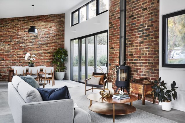 "Blending in with its bushy site, the home's corrugated iron and timber cladding reference the Australian coastal vernacular," says Atlas Architects’ Aaron Neighbour of the home’s aesthetic. Modest in size but, large enough to accommodate visiting family (there are three bedrooms), the home is energy efficient and has excellent passive solar qualities and natural ventilation. "The owners were after a home that was environmentally and socially sustainable," says Aaron. Heavily involved in the design and construction of the project, the owners hand-picked every internal finish, fixture and fitting and even undertook several construction tasks themselves including the construction of retaining walls, landscaping and site drainage. "The outcome is a cherished home with a strong sense of place and an emotional connection to the owners," says Aaron. 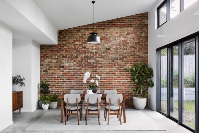 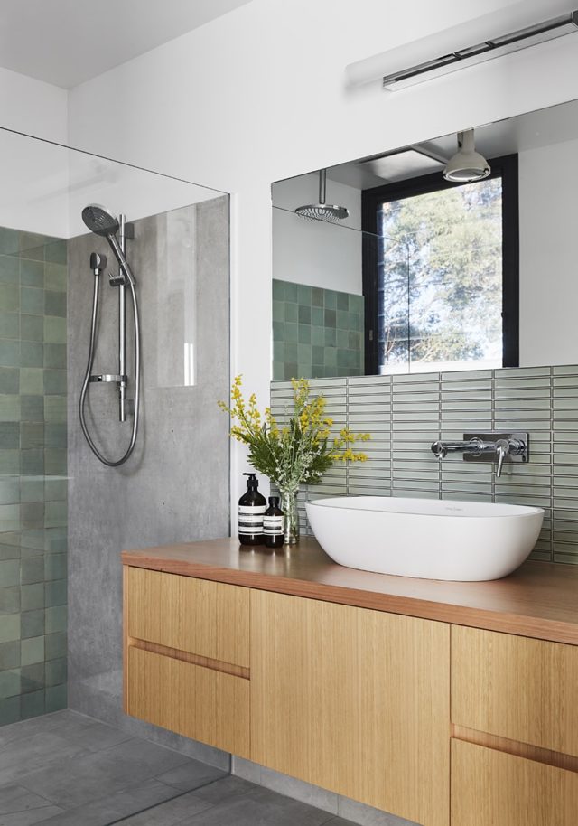 The home is comprised of a semi-public front courtyard shielded from the street by greenery and a generous setback. The private central courtyard is where the family socialises as it has direct access to the living, dining, kitchen and workshop while the rear courtyard acts as a functional outdoor space with firewood, garden storage, services, fire pit and veggie gardens. "With the tall trees retained and new medium-size trees planted, the rear courtyard has a campground vibe, referencing the couple's love for the outdoors," says Aaron. 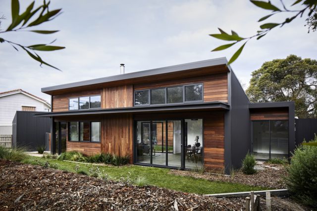 A prominent design feature, recycled clinker bricks were used for all of the internal brickwork and courtyard paving. "We love using recycled clinker brick for their sustainability, texture and tone. The mix of 70 per cent reds and 30 per cent blues create beautiful repetition and pattern that invigorates the interior space. The texture of these bricks is contrasted with the sharp lines of the white walls, further enhancing their presence," says Aaron. 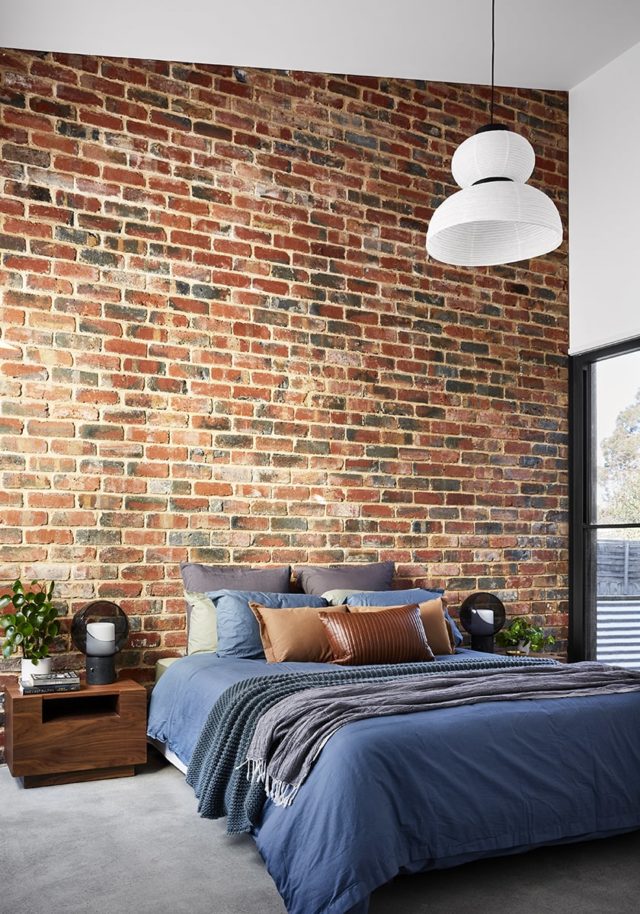 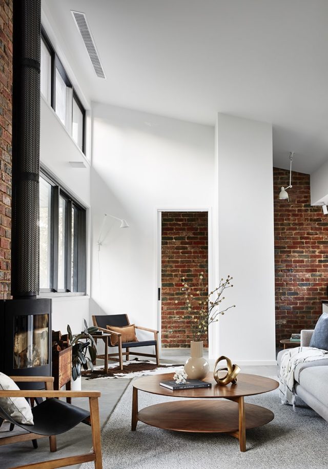 Another notable aspect of the home is its gorgeous timber bookshelf that was an impromptu feature created during the build. Constructed from offcuts of spotted gum timber that were used to clad some of the external walls, the builder created the shelves that are supported by round timber dowels. "By using the same cladding internally, we were able to bring some of the external warmth to the inside of the home," says Aaron. 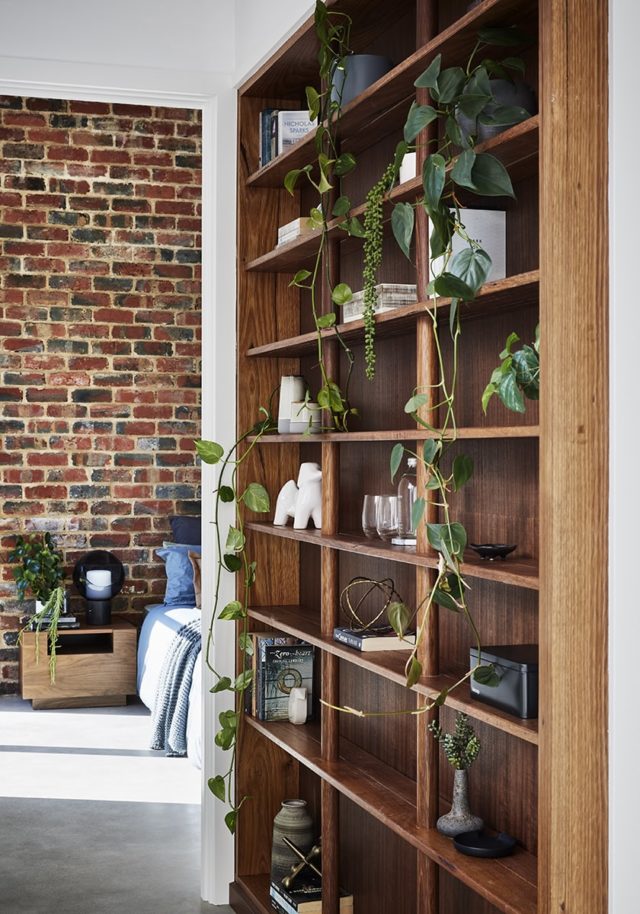 Selected by the client, the bathroom and kitchen finishes really complement the natural surrounds too. "Our client was inspired by the beautiful greens and greys that feature heavily in the Balnarring landscape and wanted to introduce this internally through tile selection and joinery finishes." 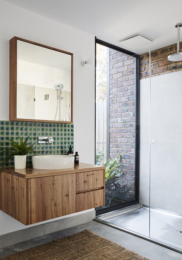 Photographer: Tess Kelly | Stylist: Homely Addiction  Fun and colour abound in artist Kate Jansen’s Mornington home Looking at her bright, mid-century inspired style, it seems that childhood trips to Palm Springs have made quite the impression on Melbourne-based artist and stylist Kate Jansen. "I would accompany… The post Reclaimed brick stars in new Mornington Peninsula sustainable home appeared first on The Interiors Addict. |
| You are subscribed to email updates from The Interiors Addict. To stop receiving these emails, you may unsubscribe now. | Email delivery powered by Google |
| Google, 1600 Amphitheatre Parkway, Mountain View, CA 94043, United States | |


No comments:
Post a Comment