Maria Killam | Classic and Timeless Colour |
| Help! My White Walls are Reflecting Other Colours Posted: 02 Dec 2021 08:41 AM PST Thank you so much to all of you who took advantage of our Black Friday Sale! We have donated $11,175.00 to our neighbours who were devastated by the November floods and will be donating more in the months to come. **Please note, before you contact our customer service department with inquiries, shipping will be considerably delayed because of the floods. Although our home and office wasn’t affected, our shipper, who was located directly in the flood zone, sustained some damage. So, you’ve painted your walls white. And now? Your white walls seem to reflect the colour outside (or even inside) and it’s super annoying. It’s not what you wanted, but does that mean you need to repaint your walls? Today I’m sharing a few reader questions about this exact issue and the secret way to work around it.
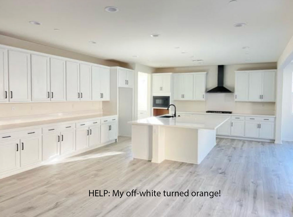
Now that white walls are here, questions about reflections are a constant too. Here’s the latest one that I received:
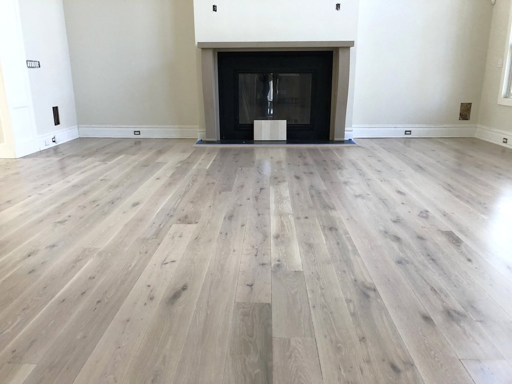
I also received another set of photos about a similar dilemma from another follower on Instagram recently. I tried to find the photos but they are buried in my messages, so I found this one online instead. This reader had just installed a similar shade of LVP in her basement. Her new grey sofa was sitting in the room and she was super annoyed that this grey flooring had a slight yellow undertone. And why was she suddenly noticing that undertone? Because everything else in the room was the same shade of green grey – that is, the floors, the sofa and the walls.
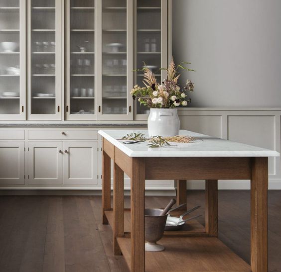
Is there a white paint colour that won’t reflect the outside or other colours in the room?So what do you think? What’s the answer? Take a moment to think about it before you read my response. The first thing I want you to notice about the white kitchen above is that there isn’t a larger black hard finish to ground all the little black accents, such as the hardware, sink, hood fan, or microwave. The eye is now jumping around the little bitty black in this kitchen. Notice how this makes the hood fan look especially distracting and pointy. A stainless steel hood in this shape would not look so harsh, because the contrast would be softer. Also, if we’re going to critique this kitchen, let’s talk about the island. Islands built circa 2021 should simply look like furniture, the end. If you’re not going to make it special with millwork and pretty legs and details, it would be better to leave it out and add a pretty baking table instead.
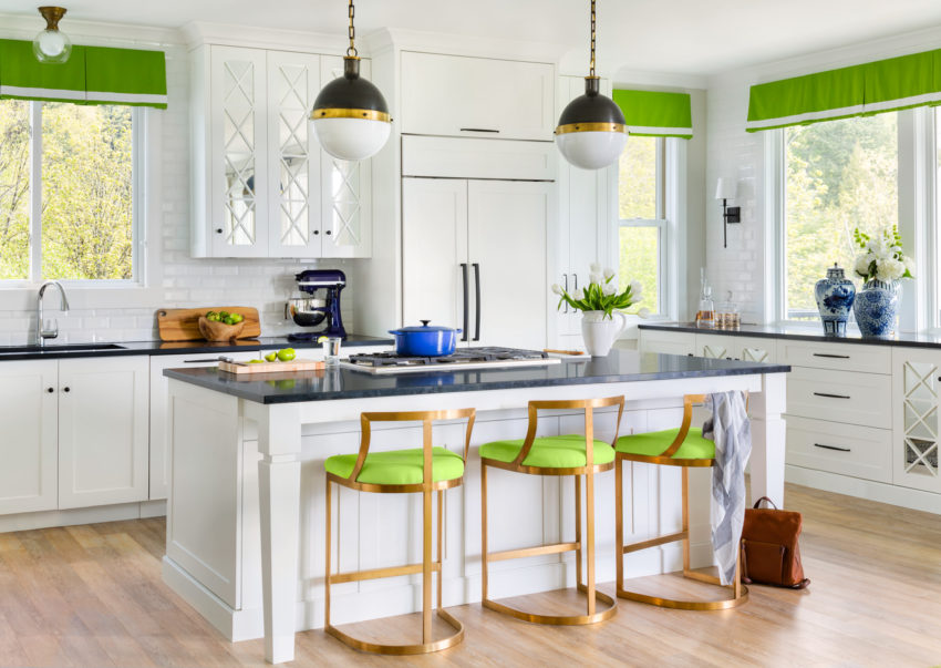
And really, this kitchen has enough space to be a cozy eat-in kitchen. A liveable look that would warm it up considerably. Also, the days of endless countertops that you’ll never do any food prep on are over. The cabinets on the left of the kitchen would be much more useful as a pantry wall, like in my kitchen below. How to decorate with blackLet me say this again. If you don’t have any black in your tile floors or countertops, then adding little bits of black accent colour with the hardware makes no sense. Just because black hardware is trending, doesn’t mean it’s the right choice for your kitchen. Don’t simply make black the default hardware choice. The black in this kitchen below RELATES to the black countertops. There is a significant amount of black to help make the black hardware fit into the design. That’s why it works well here (below):
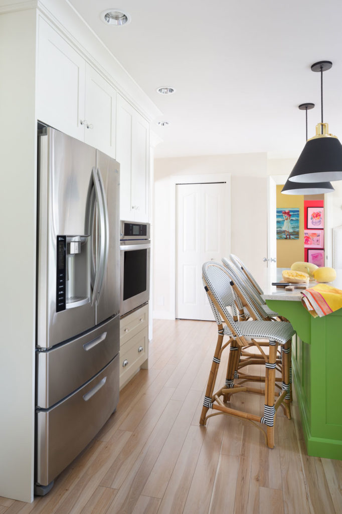
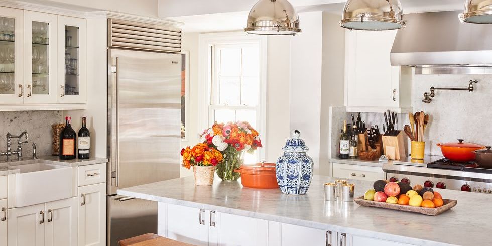
Styling & Colour by Maria Killam Ok so let’s get back to the questions above. Do they need to repaint their rooms? What is the answer? The secret to ignoring the colour reflection on your white wallsSo first, with love, help me understand why we would want to eliminate ANY hint of colour from both rooms? Ok, so there’s a slight orange undertone in your all-grey and white kitchen? This reflection of colour actually adds some much-needed warmth. And, there’s nothing wrong with that. When decorating with white walls, the goal shouldn’t be complete desaturation. No need to eliminate anything warm, yellow or orange. Don’t judge your wall colour if you haven’t decoratedIn fact, the first thing I would add to this kitchen is some warm wood tones, especially ones that are gold, beige, or orange and brown. Then, I would add a pretty accent colour. Find a pattern you love and choose an accent colour to decorate with. Once you’ve added barstools and styled the kitchen with your accent colour and some warm wood, you’ll stop noticing the walls at all. Staring at a blank room with no decorating will never make you happy but in fact will make you highly critical of anything that is there. Remember these three tips for adjusting to your new paint colour? Next, make sure you furnish the adjoining rooms as well. Sherwin-Williams Alabaster is an off-white in my Foundation Collection (available here). And in this kitchen, it relates well to the off white quartz. In order to eliminate the orange reflection, she could paint the walls a complex cream with a green undertone, or a green grey greige I suppose, (find the curated list of these neutrals here) but I’m not convinced that is necessary. There is so much more this kitchen needs first. Or you could even add some hits or orange accents to really make it work (below).
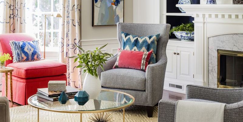
Douglas Friedman via Elle Decor And what about the all-grey room with the LVP that’s looking comparatively yellow? It’s true that these taupe-y grey floors will never be as neutral as a timeless hardwood floor. And, of course, if they looked more like natural wood, we would not need them to match the walls. However, in this case, the answer is the same. Once the room is decorated, you will NOT notice the yellow. I would guess that many of my readers are dealing with a lot of grey (in furnishings, floors, wall colours, etc.). And, because most of us can’t replace or repaint EVERYTHING at once, the secret is to WARM THINGS UP. More warmth (adding wood tones and/or colour) will make all that grey look better. Remember my reader who didn’t like all the grey flooring in the homes she was shopping for? Having colours relate is an important design principle. But let’s remember not to take it too far and end up painting ourselves into a completely monochrome box–especially an all-white box. Instead, let’s aim for quite the opposite of that. Add warm beige, orange, yellow and brown tones to work with grey colour schemes. This will help make them look more balanced, liveable and current. You could even add a sisal rug to pick up those undertones.
Michael Lee via Good Housekeeping And remember, you can’t apply brightening filters to real life. You can bet that many of those picture-perfect white rooms on Instagram reflect oodles of orange and green from their surroundings in reality, but the photo filter makes them disappear. Tweaking your off white paint won’t create magic, but decorating will. And, that’s something you can start today (no waiting on painters)! Over to you my lovelies, do you agree or disagree with my advice today? I’d love to hear from you in the comments. If you have a question for my Ask Maria column, clean up your room, take photos with natural lighting and send them here. And make sure you’re a subscriber so you’ll see the answer when I post it. Or, if you’d like my help selecting the perfect colour for your room, purchase my custom colour advice here. To learn how to Specify Colour with Confidence, sign up for one of my Virtual Spring workshops here. Related posts:23 Decorating Secrets (Only an Interior Designer will tell you) Contrasting Kitchen Island Get YOUR Colour Right 4 Reasons Your White Walls Look Bad The post Help! My White Walls are Reflecting Other Colours appeared first on Maria Killam | Timeless Colour. |

| You are subscribed to email updates from Maria Killam | Timeless Colour. To stop receiving these emails, you may unsubscribe now. | Email delivery powered by Google |
| Google, 1600 Amphitheatre Parkway, Mountain View, CA 94043, United States | |


No comments:
Post a Comment